

4 minutes
Create actionable insight with these key steps toward useful data dashboards.
The role of data in the competitive financial services sector has become extremely important. The foundational question many financial institutions face is how to utilize data to make informed decisions. Identifying the underlying and hidden patterns and meanings in analysed data gives credit unions a head start in the right direction. Good visualization approaches, tools and projects can accelerate the journey.
What is visualization? Often called business intelligence, it is a technique through which information processed from data is presented in charts, diagrams, and images to understand and explore complex phenomena, or in simpler terms, it is an organized representation of the information in your data.
The primary goal of visualization is to create an actionable insight. The challenge here lies in showing the analysis in an unambiguous manner to facilitate decision-making. The good news is that various tools are available in the market like SSRS (SQL Server Reporting Services), Tableau, PowerBI, Qlikview, Domo, etc. that can help in quick reporting, and produce interactive customizable charts that absorb real-time data.
More credit unions are adopting analytics, and data visualization can up their game because it can help them take decisions with greater confidence and accuracy on activities related to enhancing member experience, growth, loyalty and engagement. Once a credit union understands the value of visualization, the journey is just beginning. Right at the onset credit unions should internalize the three most important principles of good visualization, the 3 s’s: simple, standard and scalable.
Simple refers to the ease with which the visual reports can be interpreted. In other words, the key metrics should be on the top, and chart and graph headers should be simple and to the point. All detailed information should be at the end with appropriate colors picked, the labels visible and ordered in a consistent manner. Supported tools should be laid out well, encouraging users to use them in a systematic way to draw additional outputs for easy decision-making. For more daring credit unions, design thinking could play a role here. For example, it could make the displayed information pertinent to the user’s role, store frequent information in memory and allow sophisticated searching capabilities.
Below is the dashboard screenshot for the balance transfer campaign of a $500 million Minnesota credit union.
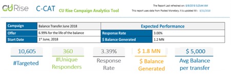
A quick glance makes you aware of the campaign results, presenting all metrics in a simple and concise manner with all important details, expectations and achievements in one place. This simple yet compelling visualization makes it easy to track the progress of the campaign.
Standard: Good visualization needs standardized data structure and elements. The complexities and disparities in presented data should be handled flawlessly and the redundancy eliminated. Using common abbreviation, proper formatting, and identical scaling for charts, along with consistent layouts across your data visualizations will help convey clear and concise insight. The dashboards will become much easier and quicker to understand when the information is standard and concrete. It will also create consistency across your organization.
Scalable: Scalable refers to a visualization project’s ability to accommodate growing volumes of data and data sources without a hitch. The increase should not impact the speed and performance of the reporting platform. In fact, the increase in data should make the visualization process and data model more efficient, effective and accurate. To increase visual scalability, the right charts and diagrams must be selected and the right underlying scripts written and the right presentation techniques utilized. These days tools have a lot of pre-defined visualization capabilities that were absent five years ago to give you a good head start. This should not stop you from exploring opportunities to customize your efforts for interactive exploration of insights in real-time.
The campaign analytics tool shown above has the capability not to track one but as many campaigns as the credit union wants. The best part is that any added data from future campaigns helps make the base model more effective and scalable. The quantity of data has a positive relationship to robustness and reliability of insights.
Credit unions might mistake buying a good visualization tool as their only hurdle to start utilizing it for better decision-making. But they also need access to technical and analytical resources and knowledge to create true business intelligence that best matches their needs. This is where third-party vendors and partners can play a vital role and be an invaluable resource. Irrespective of credit unions deciding to take up visualization as a DIY project or utilizing a third party for building it, they need to remember the 3 s’s—standard, simple and scalable—on their journey to better serving their members by drawing decisions based on useful and insightful visualization.
Karan Bhalla is CEO of CU Rise Analytics, Vienna, Virginia, a CUSO with a mission to help credit unions leverage the power of data to better understand, serve and support their members. CU Rise’s core competencies are data science, artificial intelligence, predictive modelling, business intelligence & technology services.